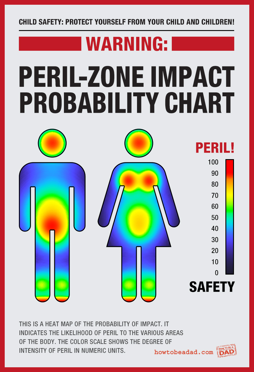
Safety from Children: Impact Probability Chart

It’s a Murphy’s Law of sorts. What can make an impact on a Peril Zone, will… reeeeally hard. Not every time, of course, but that’s what this chart is for, to show you the likelihood of impact, and where.
Instances of board-books that weigh as much as a manhole cover making a “direct hit” are more memorable than a pacifier boinking off a knee cap. So, one could argue that these probabilities only seem this way because, in recalling, some memories stand out taller in the line of life experiences. Science says otherwise.
These probability figures were developed with a Scientificish analysis of all my experience as a parent and countless episodes of America’s Funniest Home Videos.
In a split second, you just KNOW it’s going to happen! And then it does. And then the tears come, and you have to pretend that you’re just sooooo moved by your love for your child. As you ready an ice pack.
If anyone tries to tell you this chart is unreliable or based solely on the experience and observations of only one parent, and a television show, just remember that they’ve probably sustained a ton of brain damage from upper Peril Zone impacts and smile politely before they begin drooling or become violent.
““
More Warning Signs
Peril is everywhere. Beware and armor yourself accordingly.
Instructional Diagrams
Pucker up, buttercup.


